
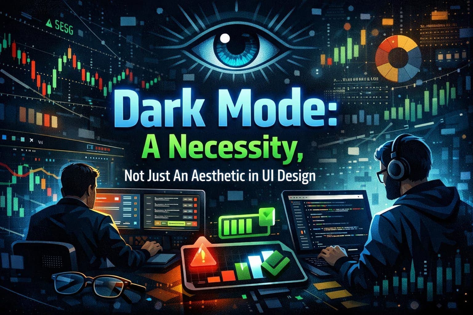
Dark Mode is a necessity and not just an aesthetic in UI Design
Abstract
Is Dark Mode just for flex for developers or just an aesthetic for users? While the opinion may differ for various persons but for long term sessions like trading and code editor, dark mode is a necessity and not a fancy feature. In this blog, I have explained why dark mode is a necessity.
INTRODUCTION
In today’s modern web development, “dark mode” is often considered as a trendy mood or vibe - a cool feature that is used by developers to show that he knows CSS variables and users mostly for aesthetics. But in specific cases like Fintech, Data Analytics, Dark Mode is not just a cool feature but a functional requirement. As I have been developing the UI of FinSense, our first project, I realized that a white background is not just bright but it was also affecting user’s experience. Here is why I think dark mode is essential for FinSense and not just an aesthetic and why beginner developers should treat it correctly.
EXPLANATION
- Strain On Eyes
Financial Analysts and traders are not just “scrolling” users, they spend hours looking on one page/dashboard. They monitor graphs, tickers, news feeds for hours.
If they are provided with a bright themed page, it will cause the user’s pupils to constrict because of blue light emitting from the screen which can cause eye strain if starred at a page for a long time. By flipping the color of the page to dark themed, we reduced the luminance and can prevent our user’s from eye strain.
- Information Density and High Contrast
Financial apps are too noisy. Though FinSense is a lightweight website, but there are websites which overwhelm you with too many features, it is important for developers to make the important data stand out for the users.
In a light themed website, the background becomes the aggressive element. In a dark themed website, the important data shines out from the receded background. Also using of various bright colors in dark theme can make things pop out from the screen such as –
1. Green gives positive vibes against a dark background.
2. Red warnings are easily noticeable.
3. White texts become sharper and more readable.
It’s all about visuals where the important data and features take the limelight while the UI is working behind the scenes. This very much adds to the user experience.
- The Halation Effect
When shifting to dark mode, there is a need to understand typography. A phenomenon known as “halation”, where bright text can appear blur for people with astigmatism on a pitch-black background.
When I was designing the UI of FinSense, I learned not to use pure black color. Instead, use of deep navy or a dark grey can be enough to prevent blurring of text for people with astigmatism while still maintaining the other benefits of dark theme.
- Psychological Comfort
The design of UI very much adds to the user’s psychological comfort. Light theme can give vibe of productivity and creativity while dark theme gives vibe of analysis and consumption.
When a trader opens a trading related website or app, they are entering in a focus state. A dark theme UI can give his brain signals to filter out all the garbage data and analyze only the data important and required for trading. In our project, a trader can feel the quiet dark environment and can analyze the trading requirements and market sentiments peacefully.
- Accessibility and Practicality
Now coming to the practical benefits of using the dark mode is-
1. The dark theme of the UI can save user’s device battery life and will help in long hour sessions. The OLED screens on most devices use very less power in dark mode than bright mode.
2. Users with light sensitivity or visual impairment can also use the website because of high-contrast dark theme and can now visualize market sentiments or any other content peacefully.
How I Implemented This:
For FinSense, I used Tailwind CSS.
@import "tailwindcss";

:root {
  --background: #020308;
  --foreground: #ffffff;
}

body {
  color: var(--foreground);
  background: var(--background);
  font-family: Arial, Helvetica, sans-serif;
}

@layer utilities {
  .glass-panel {
    @apply bg-gray-900/40 backdrop-blur-md border border-gray-800;
  }
}
Here instead of #000000 (pure black), I used #020308 which serves our purpose to prevent text blurring, still maintaining other benefits of dark theme.
CONCLUSION
If you are building a tool/website/app that requires analysis, long session times and of high intent like a trader, code editor, dark mode is a necessity and not a fancy feature. It very much adds to the user experience.
The more you can keep a user on your site, the more revenue you can generate and can also attract more user. Design is not just about looks it’s also about how much usable the design is.